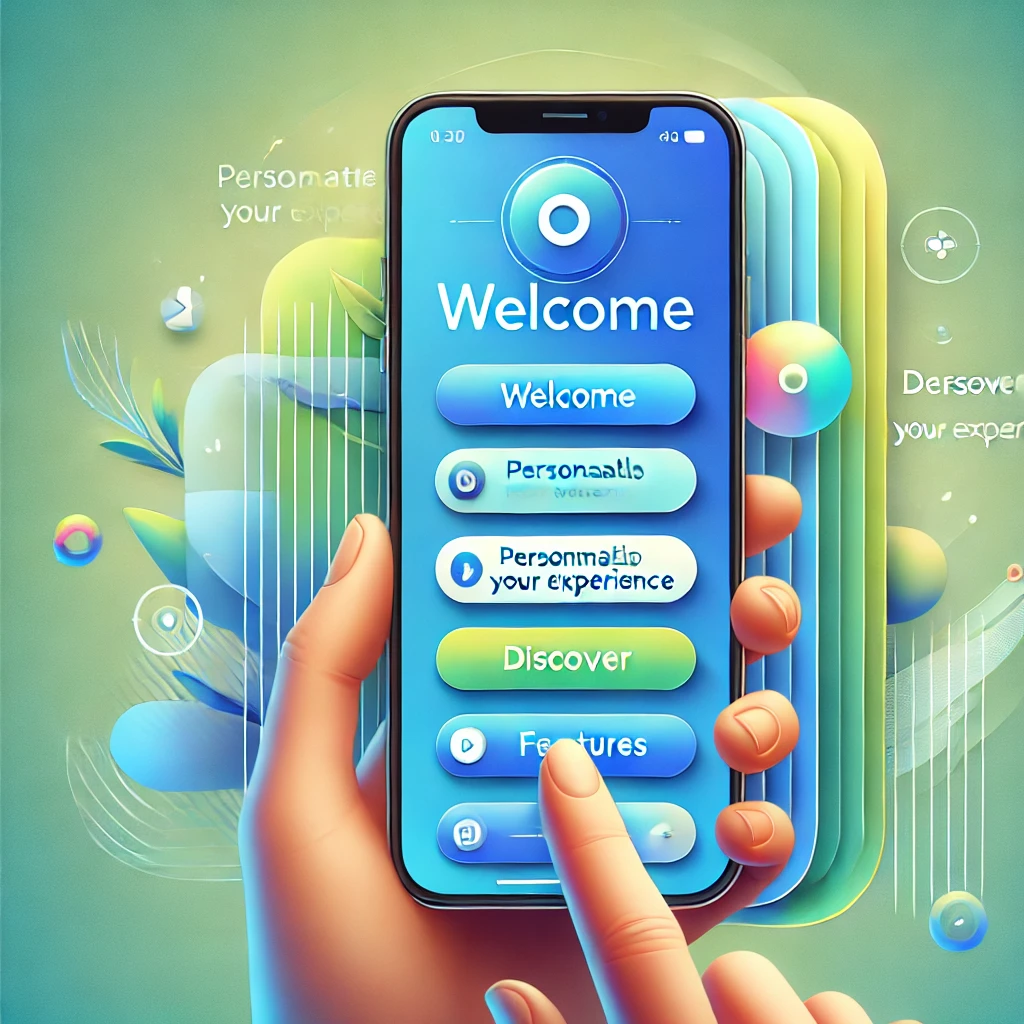
How to Create an Engaging Mobile App Onboarding Experience
Discover how to design an engaging onboarding experience that boosts user retention, engagement, and satisfaction...
READ MORE
Dec 2, 2024
In mobile app design, color isn’t just about aesthetics—it’s a powerful tool that shapes user perceptions, evokes emotions, and drives actions.
Whether you’re designing a fitness app meant to energize users or a meditation app aiming to calm them, choosing the right colors can significantly impact user behavior and overall experience.
This article explores the fascinating psychology of color in mobile app design, delves into how colors influence user engagement, and offers practical tips for creating a visually stunning and emotionally resonant app.
Color is one of the first things users notice when they open an app. It sets the tone, conveys the brand’s personality, and influences how users feel.
Research shows that people make subconscious judgments about a product within 90 seconds of viewing it—and up to 90% of those judgments are based on color.
Establishing Brand Identity: Colors can reinforce brand recognition and loyalty. For example, the blue in Facebook’s logo conveys trust and dependability.
Driving User Engagement: Vibrant, well-coordinated colors can grab attention and encourage interaction.
Guiding User Actions: Buttons, CTAs, and navigation elements in standout colors help users easily identify key actions.
Want to create a mobile app that captures attention? Explore PosterumSoft’s design services and let’s bring your vision to life.
Red stimulates energy and excitement, making it perfect for fitness or gaming apps. However, overuse can feel overwhelming, so balance it with softer tones.
Example: YouTube uses red to emphasize play buttons and notifications, driving immediate action.
Blue fosters a sense of trust, calm, and dependability. It’s commonly used in financial, healthcare, and social networking apps.
Example: PayPal and Facebook use blue to establish a sense of security and reliability.
Yellow grabs attention and conveys positivity. It’s great for apps targeting creative individuals but should be used sparingly to avoid visual fatigue.
Example: Snapchat’s yellow branding is youthful, fun, and instantly recognizable.
Green symbolizes growth, health, and tranquility. It’s a go-to choice for wellness, fitness, and eco-conscious apps.
Example: Fitbit’s green highlights encourage users to focus on their health goals.
Purple suggests luxury, creativity, and imagination. It’s ideal for apps focused on self-expression or premium services.
Example: Meditation app Calm uses purple accents to create a serene atmosphere.
Black conveys sophistication, while white represents cleanliness and simplicity. Together, they create a minimalist, timeless look.
Example: Uber’s black-and-white interface reflects modernity and ease of use.
Colors help establish a clear hierarchy by highlighting the most critical elements. For instance, contrasting colors for CTAs ensure they stand out from the background.
Colors evoke emotions that align with the app’s purpose. A meditation app may use soothing blues and purples, while an e-commerce app might use reds and oranges to create excitement.
Interactive elements like buttons or links should have colors that invite action, such as green for “Go” or red for “Stop.”
Accessible design ensures that colorblind users can easily navigate the app. Use high-contrast colors and avoid relying solely on color to convey meaning.
Duolingo’s vibrant green color scheme aligns with its mission to make learning fun and approachable. The bright tones energize users while maintaining focus on education.
Calm uses a palette of purples and blues to create a serene and soothing experience, perfectly matching its meditation-focused content.
Spotify’s black interface with neon green accents creates a modern, edgy look that resonates with its youthful audience.
Inspired by these examples? Let PosterumSoft design your app with a color scheme that speaks to your audience.
Understand Your Audience: Research your target audience to choose colors that resonate with their preferences and emotions.
Align with Your Brand Identity: Your app’s colors should reflect your brand’s personality and values.
Keep It Simple: Stick to a primary color, a secondary color, and one or two accent colors to avoid overwhelming users.
Use Contrast Effectively: Ensure text and interactive elements stand out against the background for better readability.
Test and Iterate: Conduct A/B testing with different color schemes to determine what works best for user engagement.
The psychology of color is a game-changer in mobile app design. By understanding how colors influence user behavior, businesses can create apps that not only look stunning but also drive engagement and loyalty.
Investing in thoughtful color choices isn’t just about aesthetics—it’s about creating an emotional connection with users. With the right color palette, your app can become a powerful tool for growth and success.
Ready to craft an app that wows users? Partner with PosterumSoft and let’s design an experience they’ll never forget.
Discover how to design an engaging onboarding experience that boosts user retention, engagement, and satisfaction...

Explore how mobile apps drive business growth, enhance user engagement, and increase mobile traffic in 2025...